Amy Winter
User-Centered Audit and Recommendations
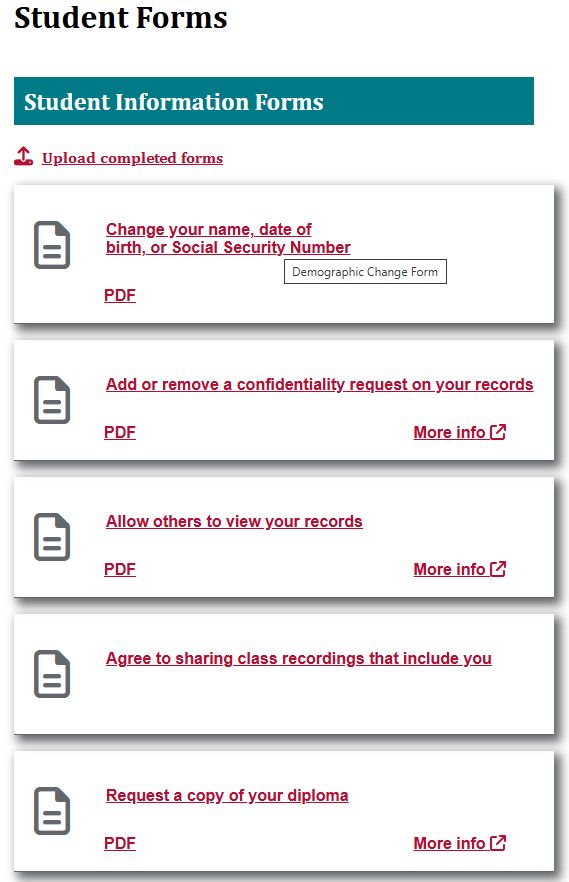
Using the Student Forms page and forms from the Office of the Registrar, University of New Mexico
Table of Contents
- Summary
- Site Choice
- Audience Analysis
- Purpose and Goals
- Method
- Participant Characteristics
- Research Questions
- Recommendations
- AI Statement
- References
Summary
A usability study of the Student Forms page on registrar.unm.edu was conducted in November 2025 by Amy Winter. The intent of the study was to identify usability problems with the design, information architecture, and user journey of the site. Study participants were fellow students in ENGL 502 in the fall semester, 2025.
During the test sessions, participants were given the same task and were asked to “think out loud” to help clarify the motivations for their actions during the test. After the test, participants responded to additional questions designed to elicit their opinions about the site. Overall, while the participants found the overall layout of the page navigation and content to be clear, they were overwhelmed by the amount and presentation of the content, and the complexity of completing the fairly simple and common task they were assigned.
An overview of the results from the study follows, with recommended changes for areas of the site where participants encountered difficulty. Additional testing should be conducted to confirm whether the recommendations result in improved usability for the site.
Site Choice
Communicating with the Registrar’s Office via the Student Forms page and forms can be crucial to a student’s success at UNM, especially where degree completion and graduation are concerned. Based on my initial assessment and given the high stakes of the tasks to be completed, the page and the form completion process were not optimized to help students successfully solve the problems they visited the site to address.
Audience Analysis
The primary audience for the Student Forms page is UNM students.
The secondary audience comprises the group of people who might provide assistance to students encountering difficulties with the forms: student advisors and other UNM staff and faculty, and family members and friends of students.
UNM's Office of Institutional Analytics provides the following data about the student body for the 2024-2025 academic year:
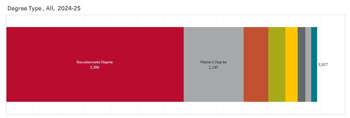
Though specific age data is not provided, from this chart we can tell that over half of the student body is enrolled in undergraduate programs. It is therefore reasonable to assume somewhat less than half of the primary audience likely belongs to Gen Z, though at least some undergraduates are likely returning students. Given the lack of data about the age range for the graduate student population as well as the large nonspecific secondary audience, design and usability factors relevant to multiple generations will be included in the assessment.
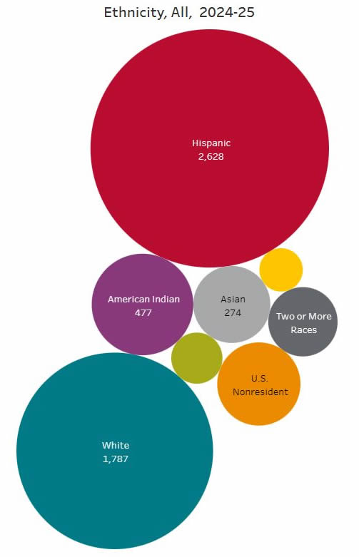
The student body is quite diverse in ethnicity and is also likely to diverge widely with regard to nationality, native language, education level, socioeconomic background, and life and work experience.
In its marketing, UNM promotes itself as a Hispanic-serving institution with a focus on first-generation college students. These audience segments present particular needs and barriers which could complicate their interaction with the Student Forms page and forms as currently presented. For example, first-generation students may not have family members experienced in navigating the details of college attendance like registration requirements and course changes. Students whose family members don't read English might also have difficulty getting support to complete complex forms.
Given that somewhere near half of the audience may be teens, who may or may not have trusted adults who can provide assistance, it makes sense to design this page and the student forms process at the most basic level of usability. Simplifying form language and interfaces and streamlining the process of completing forms will help seasoned users as well as novices complete their task successfully without additional guidance.
Purpose and Goals
- Determine whether participants can find, and understand how to complete, a form on the Student Forms page of the UNM Registrar's Office
- Understand obstacles encountered by participants in using the site and forms
- Identify recommendations for improving the user experience and usability of the site
I will analyze the design of the forms landing page and the user journey to completing the Demographic Information Change form as experienced by test participants, and make recommendations for improvements to the design, user experience, language and accessibility of the page and all its linked forms, using the Demographic Information Change form as an example. An an attempt will be made to identify potential institutional obstacles to achieving the recommendations.
Method
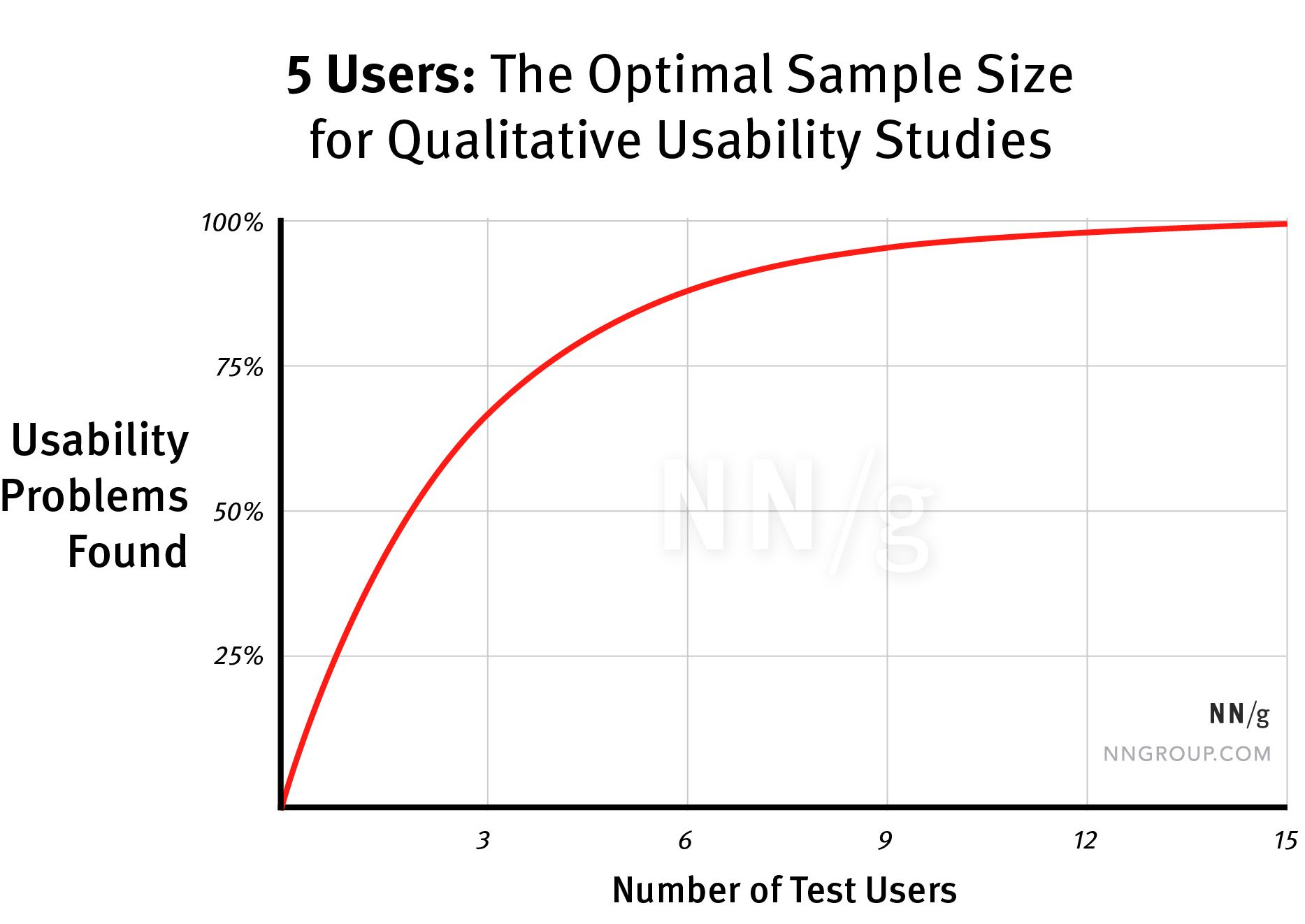
Remote moderated testing was performed with 3 testers, asking them to think aloud as they proceeded through the test session. According to Nielsen (2000), a test with a sample size of 3 could uncover up to 70% of the usability problems with a site.
The test incorporates some aspects of formative testing in that it has a small sample size. Because the product is live and in use, however, the test will also have summative aspects, in that one goal is to determine whether the design and information architecture of the site successfully communicate information the target audience is seeking, and facilitate the completion of the task the user visited the site to accomplish.
Participant recruitment
Testers are classmates assigned to the project; therefore, formal recruitment is not needed. One family member was asked to participate. There is no option to select testers based on demographic characteristics or assure that testers are representative of the identified audience for the site. Certain demographic information about the testers was collected and is shown below.
Test scenario and task
The following scenario will be read to the participants before presenting the predefined, specific, open-ended task:
“Imagine you are a UNM student whose name has changed. You were directed to this page when you asked how to officially change the name the University has on record for you.”
Each participant will receive this task to complete.
“Please talk through the steps, as you are executing them, to complete the task of changing your name on official university records. Since the site is live, please do not actually complete the task, but indicate what steps you would take if you needed to complete it.”
Test equipment and location
Participants used the device and web browser of their choice to conduct the test. One test was conducted in person in my home office in Albuquerque. Two tests were conducted online via Zoom and participants were asked to share their screens. All tests were recorded using audio and/or video and were transcribed using the Office 365 MS Word Transcribe feature. The testing script was adapted from Steve Krug’s Sample Test Script (Krug, 2010).
Test length
The test sessions lasted 20-30 minutes each.
Test moderator role
To help counteract the potential moderator bias identified by Marsh (2022) and Spool et al (2008), the following guidelines were observed:
- Create a rapport with participants by greeting them warmly, making sure they are comfortable, and emphasizing aspects of the script intended to put them at ease (“we are testing the site, not you,” “you cannot make a mistake” etc.)
- Organize test materials and equipment before the session whenever possible
- Record test sessions using Zoom
- Listen well without reacting to participant comments
- Refrain from commenting on participant actions except for task reminders; use neutral responses when needed (“OK,” “I understand”)
- When participants ask specific questions, ask them what they would do if they were doing this by themselves, before answering their question
- Exercise patience; allow participants to take the time they need to work through problems, complete tasks and respond to questions
- Provide nonspecific encouragement (“OK, please try that again”) should participants become frustrated or misunderstand aspects of the task or the site
- Be flexible when deviation from the test plan is necessary, or when it becomes obvious a participant cannot complete the task
Participant characteristics
In total, 3 individuals participated in the study.
Age
| 20s | 1 |
| 30s | 1 |
| 70s | 1 |
UNM Affiliation
| Graduate student | 2 |
| None | 1 |
Research Questions
Moderator observations and participant comments were recorded to address the following research questions.
- Who do participants identify as the target audience for the site?
- What obstacles do participants encounter in locating the correct form?
- What obstacles do participants identify in understanding how to properly complete the form?
- What recommendations do participants have for improving the design, content, organization, function, and user journey of the pages and forms evaluated?
Empathy Map
To enhance the audience analysis, an empathy map was created following the first user test session.
Positive findings
The user thought that it was “handy” to have a central location where multiple tasks could, in theory, be completed. She also thought it was convenient to have the material available online so that students didn’t have to visit an office in person. She thought that online forms were better than paper because “if I make a mistake on the fillable form, I can just change it easily.”
Problems and obstacles
The user had a difficult time with many aspects of the site. She struggled to identify the purpose of forms based on their unintuitive names. She found the form instructions complicated, with too many steps, and requiring hardware or software resources she couldn’t access on a mobile device. She was frustrated by links that were too small to tap or did not work as expected. She found spots where she had to scroll horizontally or pinch to zoom on her mobile device. This resulted in a decrease in her confidence in her ability to navigate and use the site.
Findings
Participant difficulty rating
Participants were asked to rate the difficulty of completing the task:
| Not difficult at all | 0 |
| Moderately difficult | 0 |
| Very difficult | 3 |
Participant confidence rating
Participants were asked to rate their confidence in completing the task, had they been attempting it in real life:
| Not at all confident | 3 |
| Moderately confident | 0 |
| Very confident | 0 |
Moderator completion rating
The task was rated successfully completed if, at any point during the test, with or without moderator assistance or a reminder of the task instructions, the participant:
- Located and viewed the Demographic Change Form online version.
- Noticed that they need to also download and then upload the PDF version after combining it with required documentation and obtaining necessary signatures.
- Could point out where they would upload the form if they needed to complete it later.
Ratings:
| Complete | 1 |
| Incomplete | 2 |
Participant Observations
- The amount of content on the Student Forms page is overwhelming.
- “There are so many forms and documents. It’s taking me a couple of minutes just to read what they are.”
- “I thought that there was a lot of stuff there, and I didn’t really know what a lot of it meant.”
- Presentation and explanations are incomplete or inconsistent.
- “I’m not entirely sure what this column “Online” means. It seems to only appear in some places and not in others.”
- “I guess the first thing would be just figuring out what’s the difference between online and PDF.”
- “I'm not seeing anything that I would expect, I guess something that would say like maybe student personal information.”
- “There's instructions like pretty clear in red, obviously a link, for a lot of sections, and then not for some others.”
-
Some links do not work.
- “One of the links didn’t work, so I couldn’t follow, and that was frustrating.”
- “And then this page is not found. Wow. What is happening? Torture.”
-
Task completion requires additional resources.
- “At this point I’d go, OK, it doesn’t look like I can do this on this tablet, so I need to go someplace else.”
- “The fact that I have to go find a computer is one thing. The other is, it’s not really clear to me whether or not I can do it.”
- “All the documents [combined] in one document…That might be a bit challenging if I don’t know how to put them all together.”
- Participants are not confident about completing the task.
- “I think I would probably have to contact somebody…This is, like, out of my comfort zone, definitely.”
- “If I were who I am, doing this, I’m not sure that I could have completed that process.”
- The user experience makes participants question the institution's reliability and intentions.
- “Do I want to take the documents, the legal documents with me, or do I want to make online copies and put them in one file and trust the system to be safe?”
- “I know [for] some people a name change can be a really big deal -- so to put all these steps in and try to pay attention and do the right thing and then have it not amount to anything. That's definitely disheartening. And it could feel like the university maybe doesn't care about knowing who I am and wanting to make sure that who I am is properly represented in my documentation.”
Moderator Observations
- All participants successfully identified "UNM students" as the primary audience for the Student Forms page.
- One participant could not identify the form that would allow her to change her name. One participant selected the correct form after several minutes of reading through and considering the list of forms. One participant selected the correct form by clicking through to each form and evaluating it.
- The language and tone on the pages and forms of the Registrar's Office is bureaucratic at best and oppositional at worst, contributing to increased anxiety in users and almost working against users instead of collaborating with them to complete required tasks. Language that is more welcoming, that acknowledges the user's desire to comply with university regulations, might create a friendlier, more engaging experience which could positively influence the user's opinion of the university as a whole.
- The students using these forms, and/or their helpers, value education. They want to follow rules and solve problems, since they are trying to complete a required form to support the student's success (as opposed to ignoring the student's problem or giving up on trying to solve it). The forms process should support these users who are already attempting to comply with university regulations to the best of their ability.
Recommendations
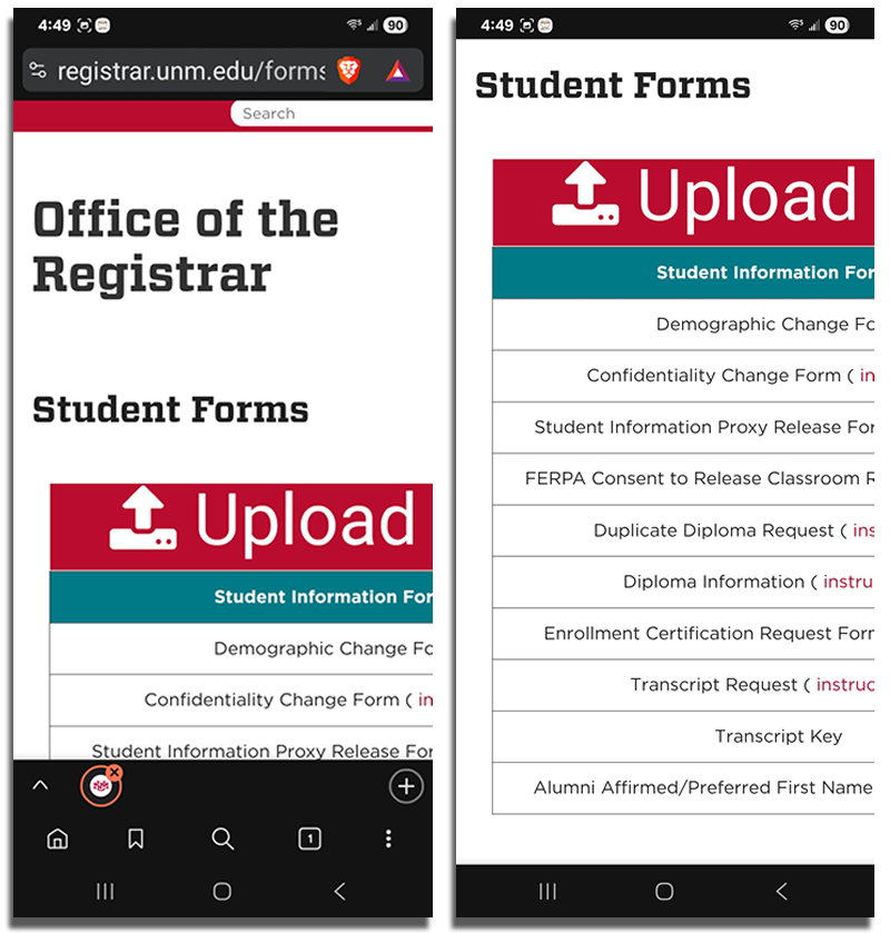
Make the Student Forms page mobile responsive. These screenshots from my Samsung Galaxy show that important content is not currently visible and requires horizontal scrolling to view.
- Describe each form's purpose in simple, friendly, action-oriented language.
- Don't use a table; create an accessible, responsive layout.
- Move official form name into a title tag, where it will be visible on hover to stakeholders who need it.
- List forms by frequency of use.
- Ensure all links work, and that they open in a new tab.
- Include link to FastInfo instructions on forms to help declutter the main page.
- Eliminate PDFs if possible:
- They can present accessibility problems
- PDF forms process cannot be completed using a mobile device
- Allow uploading of multiple documents instead of requiring users to combine them.
- Allow attaching a photo of ID; this would be helpful to mobile users.
- Assess whether the instructions on separate, intermediate screens are necessary. If so:
- if instructions are standard for all forms, include them on the main forms page
- if instructions differ based on the form, include them on the form
- Remove instructions that can be better presented in other ways. For example, instead of instructing users to wait after submitting a form, use a progress bar or spinner to indicate the submission is proceeding.
- Instructions should show up at the step of the process where they apply. Users should not have to remember them after proceeding to a different screen.
- Create a brief video demonstrating the form completion process.
View the design comprehensive prototype
Page code for design comprehensive prototype
Possible institutional obstacles to implementing recommendations
There are many internal reasons why these recommendations may be difficult or impossible to implement. However, implementing any changes that are possible will improve the user experience of the page and form process.
- Cost/dedication of staff time to redesign and reprogramming
- Security and identity verification concerns. This is likely the reason for requiring copies of ID and other documents to accompany the form.
- Problems handling and processing multiple documents. This is likely the reason why users are currently required to combine all documents into one.
- Difficulty integrating with enterprise systems like Banner or SalesForce.
- The needs of other stakeholders like student advisors, faculty, and Registrar's Office staff.
AI Statement
As far as I am aware, artificial intelligence resources were not used in the performance of testing sessions, analysis of data, or preparation of the test report, except for the unavoidable AI Overview presented at the top of Google search engine result pages.
References
- Krug, S. (2010). Rocket Surgery Made Easy: The do-it-yourself-guide to finding and fixing usability problems. New Riders.
- Marsh, S. (2022). User Research: Improve product and service design and enhance your UX research. Kogan Page.
- Nielsen, J. (2000, March 18). Why You Only Need to Test with 5 Users. NNGroup. https://www.nngroup.com/articles/why-you-only-need-to-test-with-5-users/
- Office of Institutional Analytics, University of New Mexico. (2025). UNM Fact Book. https://oia.unm.edu/facts-and-figures/index.html
- Schriver, K.A. (1997). Dynamics in Document Design. John Wiley and Sons.
- Spool, J., Chisnell, D., Rubin, J. (2008). Handbook of Usability Testing. Wiley.
- Stanley, C. (2025, August 11). Designing a Municipal Website That Serves All Generations. GovWeb. https://www.govweb.com/2025/08/designing-a-municipal-website-that-serves-all-generations/